Data
The purpose of visualization is insight, not pictures. ― Ben Shneiderman

Introduction
In November 2014, the Prime Minister of Singapore announced to promote and develop active mobility such as walking and cycling as part of sustainable urban living in order to achieve a car-lite society. To promote active mobility as a popular commuting means, walking and cycling paths are built and designed within a shared path due to space constraints. For safety, cycling paths are designed to be seperated from vehicular traffic on a different level. However, do these paths really help to minimise conflict between pedestrians and cyclists by separating them within the shared paths? In this project, I will look into the shared paths at Sembawang since there are a few shared paths built along the streets of Sembawang where I can collect more data. Based on my observations, not everyone is taking the paths that they should be taking. This may increase in human traffic flow, causing danger to both pedestrians and cyclists. To collect accurate data, the number of people who walk or cycle correctly and wrongly are collected according to each and every street of Sembawang that has shared paths. I went to collect this set of data during weekdays and between 5.30pm to 7.00pm, the period whereby most people end work and cycle home.
Data Visualisation
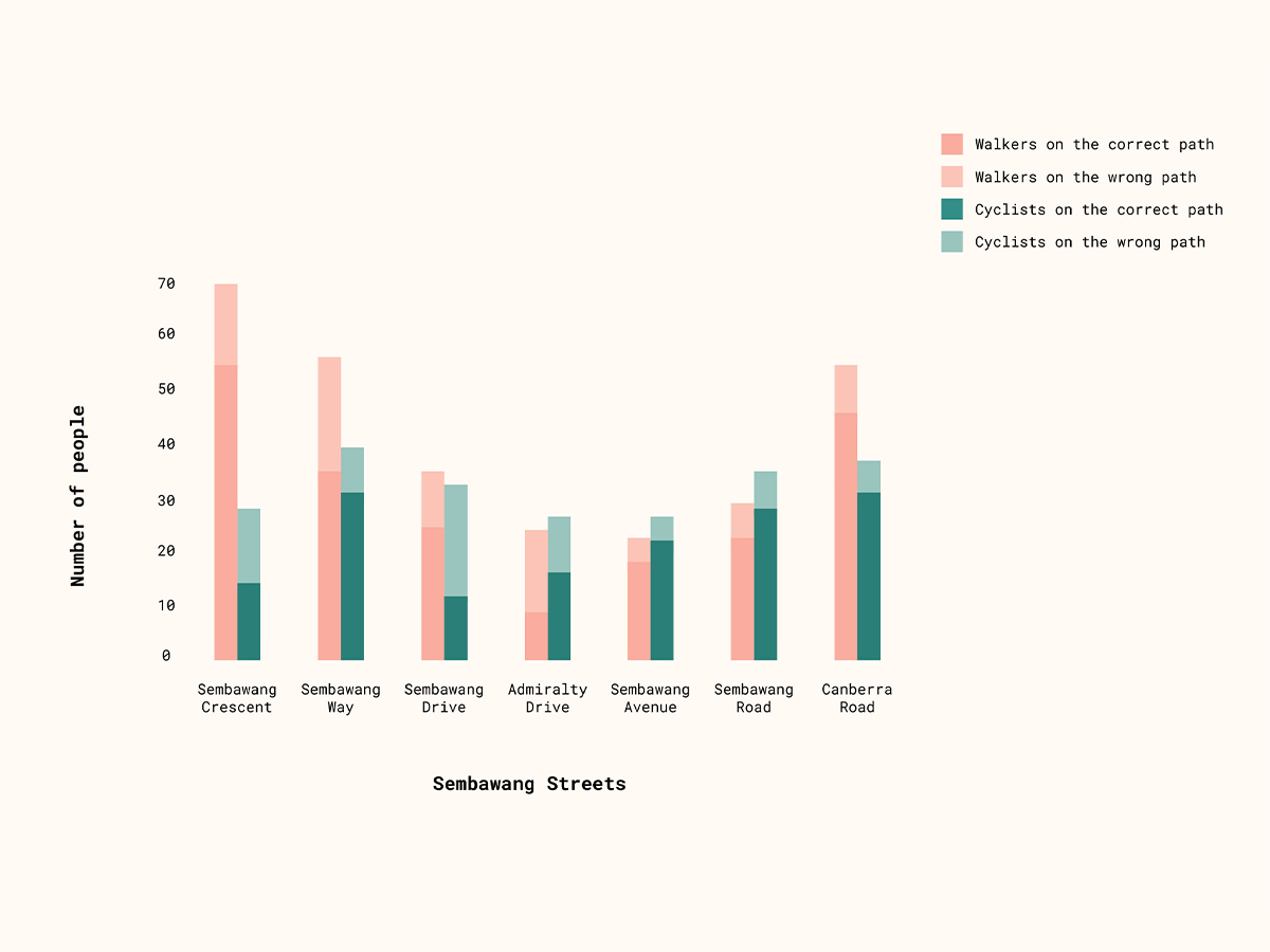
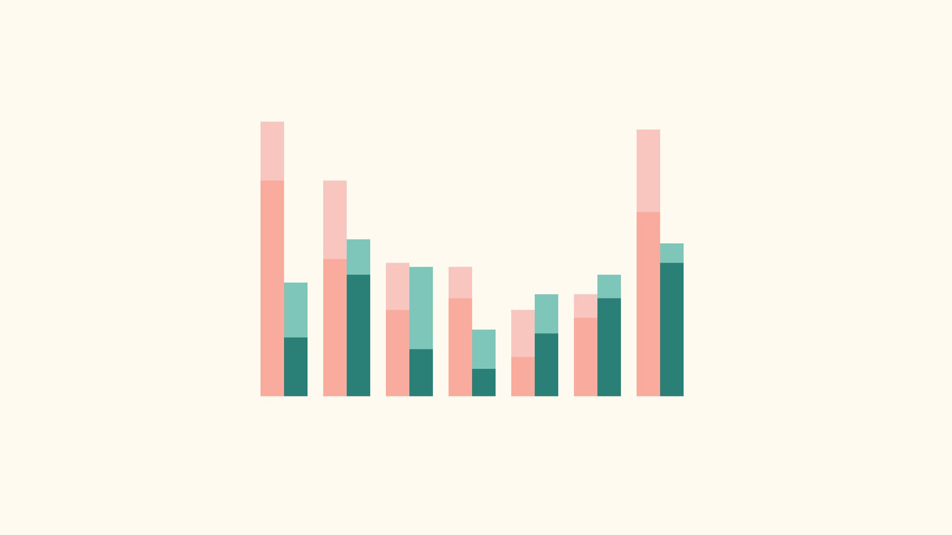
The type of data visualisation I have used is a stacked bar chart. I intend to show the number of cyclists and pedestrians who took the shared paths correctly and wrongly according to the streets. Thus, I used the stacked bar chart to present the data since there is a number of data to show within a column. This type of bar chart can also show the difference between the number of cyclists who took the path correctly and wrongly, as well as the pedestrians. The difference in colours and tones also help readers to understand and differentiate the data easier with the legend given at the top right corner.
Findings
I found out that there are more pedestrians than cyclists along the streets of Sembawang. There are still more people who keep to their path than people who do not. According to the data, there are more cyclists who take the wrong path as compared to pedestrians. Pedestrians who do not keep to their own lane can cause cyclists to cycle out of their path, causing inconveniences for cyclists and not maintaining on their own path.
Insights
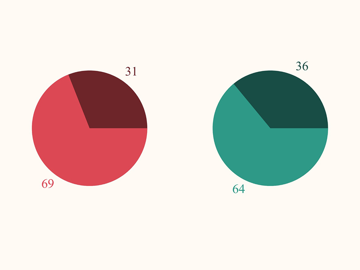
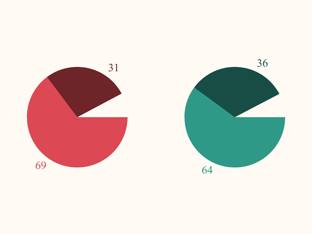
In this pie chart, it compares the number of walkers and cyclists who take the paths correctly and wrongly in percentage. From what I have understood from the chart, there is one third of the population who did not keep to their own path at Sembawang. This means that the shared paths do not really work for everyone. I have also learned that it is easier to read and understand data from a graph rather than reading from a list of numerical data. However, graphs must also be chosen correctly and wisely in order to make a better analysis and understanding.


Conclusion
The stacked bar chart is useful when presenting all of the data found and comparing the data within and across the other bars. However, it may look more complicated at the first look since it takes more time to figure out the representation of each colour to understand the data as compared to a pie chart. After analysing the data, even though there is more than half of the population who took the shared paths seriously at Sembawang, these shared paths may result in possible accidents in some ways since the number of people who do not keep to their own path is about one-third of the population.
References
- "WALKING AND CYCLING Design Guide". Ura.Gov.Sg, . https://www.ura.gov.sg/Corporate/Guidelines/-/media/BD725DB201DB496A93569C8072DD9FD0.ashx.
